Line charts
Line charts display one or more value sequences represented by horizontal lines running from each value to the next one, as shown in Figure 3-9. Commonly used for the presentation of values over time, as in financial profit and loss charts, the horizontal (or x) axis traditionally represents the time interval, such as days, months, or years.
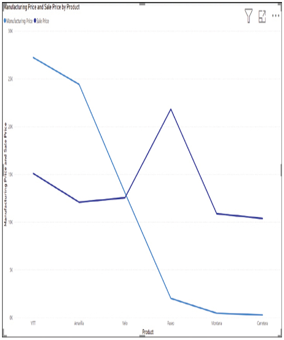
FIGURE 3-9 A line chart in Power BI
Combo charts
Power BI supports the combination of line and column charts into a composite that overlays line data onto a series of columns. The combination of the two chart types makes it possible to compare data sets that share the same x-axis, as in Figure 3-10. In this figure, the line represents the profit margin for a series of products and the columns represent their manufacturing and sales prices.
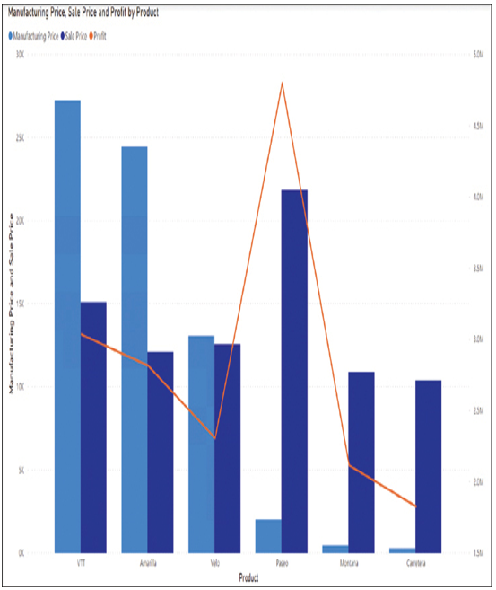
FIGURE 3-10 A combo chart in Power BI
Area charts
An area chart is essentially a line chart with the space between each line and the x-axis shaded, as shown in Figure 3-11. By using translucent shading, the chart can display the overlap between the two sets of values.
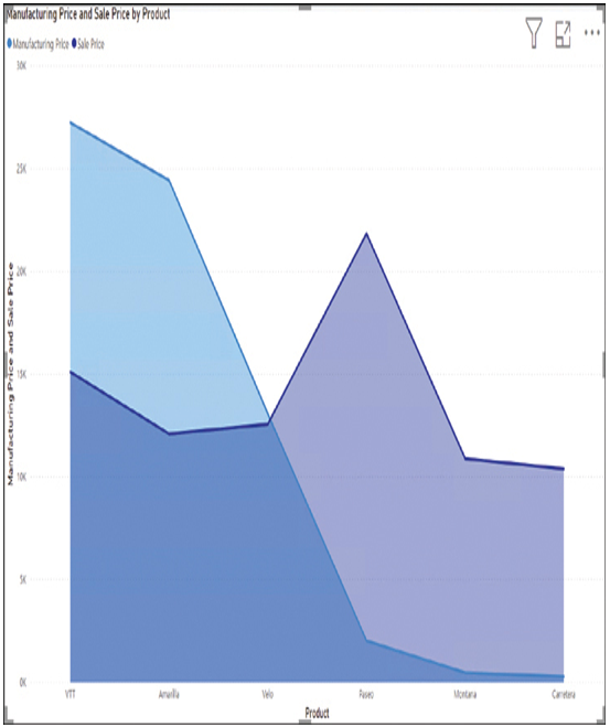
FIGURE 3-11 An area chart in Power BI
Pie charts
A pie chart consists of a circle resembling a pie divided into two or more slices shaded in different colors to represent numerical values, as shown in Figure 3-12. Designers typically use pie charts to illustrate percentages, with the entire pie representing 100 percent of the statistic.
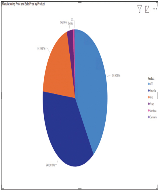
FIGURE 3-12 A pie chart in Power BI
Donut charts, a variation of the pie chart, consist of a ring (or annulus) divided into segments in the same way, as shown in Figure 3-13.
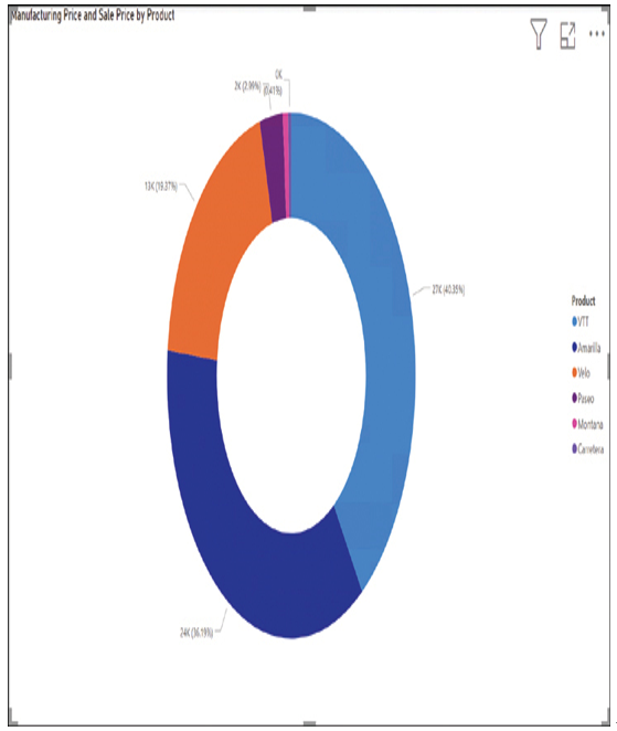
FIGURE 3-13 A donut chart in Power BI
Scatter plots
Unlike bar, column, and line charts, which usually dedicate the x-axis to a time scale, scatter charts (or scatter plots) use both axes for numerical data values and indicate data points at the intersection of two values on the scale, as shown in Figure 3-14.
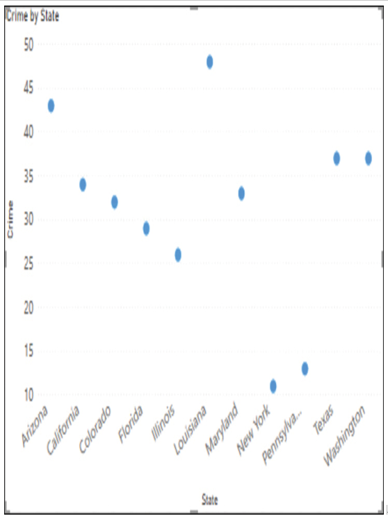
FIGURE 3-14 A scatter chart in Power BI
A variation on the scatter chart is the bubble chart, which adds a third data value by modifying the size of the data points to represent a third dimension, as shown in Figure 3-15.
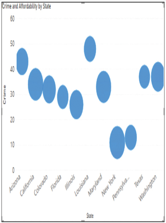
FIGURE 3-15 A bubble chart in Power BI