Key performance indicators
A key performance indicator (KPI) is a chart that indicates the progress of a single data point toward a specific predetermined goal. A KPI begins as a standard chart with a time interval on the x-axis, which represents the trend, and a data indicator value on the y-axis. Then the developer specifies a goal, which is a single value, and the chart appears as shown in Figure 3-16.
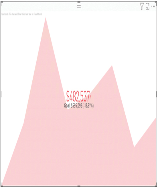
FIGURE 3-16 A key performance indicator chart in Power BI
The area chart in the background displays the current trend values, and in the foreground is the current numerical value and the goal value, plus a percentage that specifies how far off the current trend value is from the goal.
Cards
In a Power BI dashboard or report, a card is a tile that contains a single number in large, easily readable type, as shown in Figure 3-17. Designers use a card when there is a single numerical value important enough to be displayed by itself.

FIGURE 3-17 A Power BI card
Gauge charts
A radial gauge chart displays a single value and its relationship to a specific goal, using a semicircular dial with a colored indicator representing the statistic’s current value and a needle representing its ultimate goal, as shown in Figure 3-18, similar to that of an analog fuel gauge on an automobile dashboard.
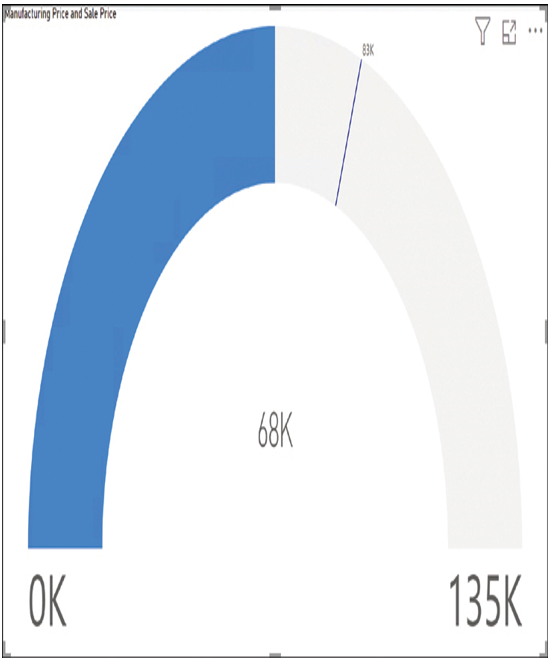
FIGURE 3-18 A gauge chart in Power BI
Key influencers
A key influencers tile allows consumers to explore the factors that affect a specific metric. When you create the visualization and select fields from the data source, Power BI performs an analysis and creates a chart like the one shown in Figure 3-19. Selecting one of the factors on the left modifies the column chart on the right.
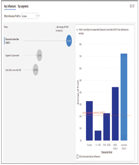
FIGURE 3-19 A key influencer tile in Power BI