Skill 3.1: Identify common Power BI components
The process of creating a simple Power BI dashboard consists of the following basic steps:
Connect to data sources
Transform the data
Create report visualizations
Build the dashboard
Publish the dashboard
As dashboard designers work through these steps, they encounter the various Power BI components that can aid them in creating a compelling dashboard design.
This skill covers how to:
■ Describe the Power BI Desktop Reports, Data, and Model tabs
■ Describe uses for custom visuals including charts or controls
■ Compare and contrast dashboards and workspaces
■ Compare and contrast Power BI Desktop and Power BI Service
Identify and describe uses for visualization controls including pie, bar, donut, and scatter plots and KPIs
Visualizations are the formats designers can use to display data in a Power BI dashboard or report. Power BI provides a large selection of visualizations to choose from, including various types of charts, tables, maps, gauges, apps, and cards.
When creating a Power BI dashboard or report, the designer must first connect to a data source and, if necessary, transform the data. Once these tasks are done, the designer can select the visualization that Power BI will use to display the data from the Visualizations pane on the right side of the workspace, as shown in Figure 3-2.
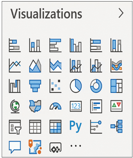
FIGURE 3-2 The Visualizations pane in the Power BI workspace
Microsoft occasionally adds new visualizations to this pane, so it might not appear exactly as shown here. Some of the visualizations that are currently available for use include the following.
Bar and column charts
Bar and column charts display numerical values as adjacent horizontal or vertical shapes, making possible the easy comparison of relative values, as shown in Figure 3-3. Typically used for comparisons of like values, horizontal bars are preferable for qualitative values such as distance and speed. Vertical columns are commonly used for numerical values representing quantities, sizes, and costs. However, these definitions are not absolute.
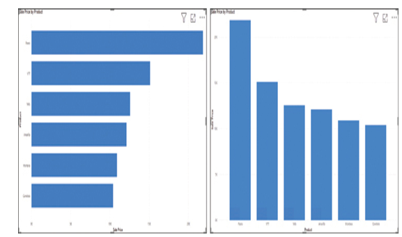
FIGURE 3-3 Bar and column charts in Power BI
Power BI provides visualizations supporting several different types of bar and column charts, including the following:
■ Stacked—Charts that combine two or more values in each bar or column, as shown in Figure 3-4
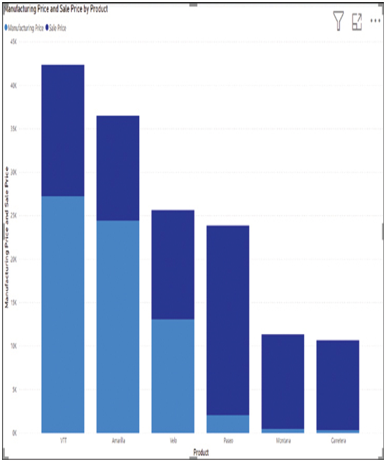
FIGURE 3-4 A stacked column chart in Power BI
■ 100% stacked—Charts that combine two or more percentages to display their values out of 100 percent, as shown in Figure 3-5
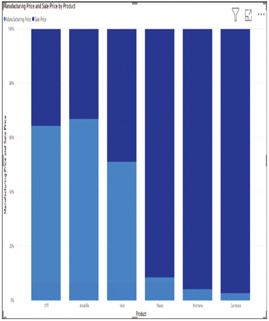
FIGURE 3-5 A 100% stacked column chart in Power BI
■ Clustered—Charts that display groups of values as adjacent bars or columns, as shown in Figure 3-6
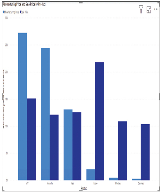
FIGURE 3-6 A clustered column chart in Power BI
■ Funnel—Bar charts that display values in descending numerical order, creating a display that resembles a funnel, as shown in Figure 3-7
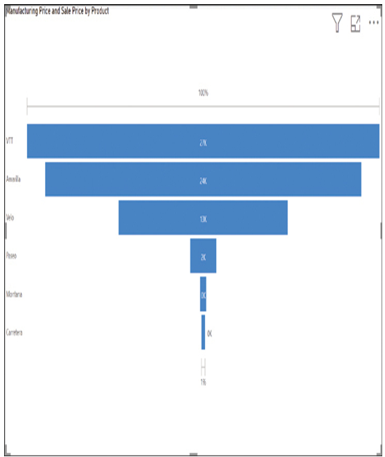
FIGURE 3-7 A funnel chart in Power BI
■ Waterfall—Column charts that split a single statistic into sequential increments, typically representing intervals of time or category, as shown in Figure 3-8
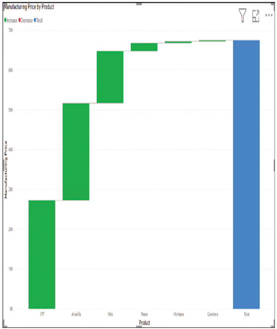
FIGURE 3-8 A waterfall chart in Power BI