Design data layout and mapping
The combination of the pinned visualizations from reports and the additional material available through the Add tile dialog box allow developers to design dashboards that tell a specific story to the consumers and provide them with access to more detailed information in the reports themselves. Deciding what information needs to appear on a dashboard and how that information should be visualized is an important part of the dashboard design and creation process.
Designing for screen size
Because a dashboard is only a single page, developers must consider the size of the screen that consumers will be using to view it. Dashboards are scrollable, both vertically and horizontally, so it is possible to create a page that is longer or wider than the actual screen, but developers typically should try to avoid overly large pages for the convenience of consumers. This is especially true when consumers will be using mobile devices with small screens.
After the developer has pinned all the desired tiles to the dashboard, it is possible to move them around, resize them, and add titles and subtitles to create a usable configuration.
The choice of display is up to the consumer, but developers might want to consider sizing dashboards to accommodate full-screen mode, with which consumers can eliminate all the surrounding frames and navigation panes to display only the dashboard itself.
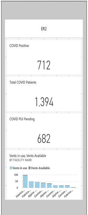
When working with a dashboard in Power BI service, developers can switch between the standard web view and a mobile view, as shown in Figure 3-66. The mobile view arranges the titles vertically on a scrollable interface so that text is readable on a smaller screen.

FIGURE 3-66 Mobile view of a dashboard in the Power BI service
Emphasizing importance
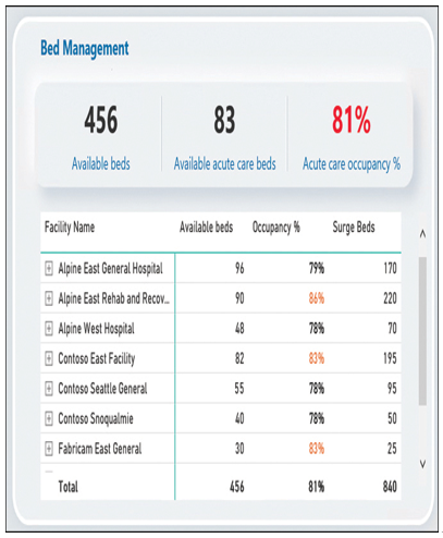
The other design consideration that developers should observe is the relative importance of the visualizations being displayed. For example, in the detail from the sample dashboard shown in Figure 3-67, the table lists the available beds and the occupancy rate for each of seven facilities, with totals at the bottom. However, to provide the consumer with an immediate overview of the data, the totals for all the facilities combined are also displayed above the table in card tiles, using much larger type.

FIGURE 3-67 Dashboard table tile with significant statistics displayed as card tiles
The decision as to what data is most important is, of course, particular to the subject and to the audience for the dashboard. New developers might find that the dashboard design process requires some trial and error, both to accommodate the screen size and to select the tiles from the report that are most important to the consumers. The process might even involve modifications to the report from which the tiles are taken. For example, an elaborate chart visualization might be appropriate for the report, but a developer might find it necessary to create some smaller card tiles isolating the most significant statistics from the chart and pin those to the dashboard to save space, rather than including the entire chart.