Describe the Power BI Desktop Reports, Data, and Model tabs
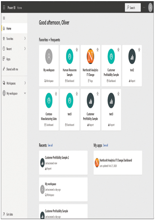
The Power BI service interface, shown in Figure 3-25, has a menu on the left side of the workspace that provides the primary means for users to navigate around the site. The collapsed menu icon (often called the hamburger button) at the top of the menu toggles between the full menu and a narrow button bar that clears more room for the workspace.

FIGURE 3-25 Home tab of the Power BI service interface
The tabs on the menu bar provide users with access to the various parts of the interface, as follows:
■ Home—Displays tiles providing access to the user’s favorite, frequently accessed, and recently accessed Power BI elements; the user’s workspaces and apps; elements that have been shared with the user; and recommended apps
■ Favorites—Displays tiles providing access to the Power BI elements that the user has designated as favorites
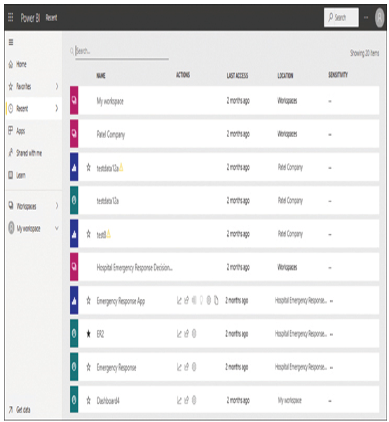
■ Recent—Displays a list of Power BI elements that the user has accessed recently, as shown in Figure 3-26

FIGURE 3-26 Recent tab of the Power BI service interface
■ Apps—Displays tiles providing access to the apps the user has added to the interface
■ Shared with me—Displays a list of reports and dashboards shared with the current user, divided into categories by the sharing user
■ Workspaces—Displays a list of the workspaces created by the user
■ My workspace—Displays a list of the elements in the user’s current workspace, including dashboards, reports, apps, data sets, and local data sources
■ Get data—Appearing at the bottom of the pane, displays the Get Data tab, with tiles that allow the user to discover and create content using files, databases, online services, and apps published by other users
In Power BI Desktop, when a user opens a file (or creates a new one), the navigation pane on the left contains the following tabs:
■ Report—Displays the pages of the current report file and the Visualizations and Filters panes, which developers use to create and modify those pages
■ Data—Displays the contents of the document’s data sources and the controls for adding measures and transformations
■ Model—In a report with multiple data sources, displays the relationships among the selected tables
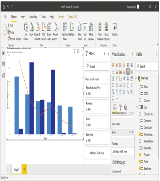
The Report view in Power BI Desktop, shown in Figure 3-27, is similar to the workspace edit view in the Power BI service, with the Fields, Visualizations, and Filters panes on the right side of the screen, each of which the user can collapse independently for more workspace. However, Power BI Desktop has a ribbon at the top of the screen, much like an Office application, rather than the button bar found in the service.

FIGURE 3-27 Power BI Desktop Report view